Sahar Aziziyan – Beauty Therapist Logo Design
Business Overview:
Sahar Aziziyan is a professional beauty therapist offering a range of high-end beauty treatments and therapies. The business focuses on providing personalized care that enhances the natural beauty of clients, combining modern techniques with a deep understanding of aesthetics. The name “Sahar Aziziyan” has become synonymous with luxury and excellence in the beauty industry.
Logo Concept:
The logo for Sahar Aziziyan was designed to exude luxury, elegance, and professionalism, key qualities that reflect the brand’s identity. The logo features a stylized “S” incorporated within a lotus flower, a symbol of purity, beauty, and spiritual awakening. The lotus, with its roots in mud but blossoms pure and beautiful, symbolizes the transformative nature of beauty therapy – turning challenges into confidence and beauty. The gold color adds a sense of opulence and prestige, making the logo stand out as a mark of quality and sophistication.
Color Palette and Symbolism:
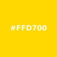
•Gold (#FFD700): The primary color used in the logo is gold, representing luxury, wealth, and success. It gives the logo a regal and high-end appearance, resonating with the premium services offered by the brand.
Color Breakdown:
