C.B.E. (Cafe Bar Equipment) – Logo Analysis
Business Overview:
Cafe Bar Equipment (C.B.E.) specializes in providing high-quality equipment and supplies for cafes and bars. Their offerings include a wide range of products such as coffee machines, bar tools, and accessories, all tailored to meet the needs of both small cafes and large bar establishments. The company is dedicated to enhancing the efficiency and aesthetics of cafe and bar operations through their premium equipment.
Logo Design Features:
•Classic and Elegant Typography: The logo features a combination of serif and script fonts, which together create a sense of sophistication and professionalism. The script font for “Cafe Bar” adds a touch of elegance, while the serif font used for “equipment” conveys stability and reliability.
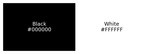
•Monochromatic Color Scheme: The black and white color palette reinforces the brand’s classic and timeless appeal. This minimalist approach ensures that the logo is versatile and easily recognizable across various mediums and backgrounds.
•Circular and Square Elements: The logo’s design incorporates both circular and square shapes, symbolizing completeness and structure. The circular element is often associated with unity and continuity, which aligns with the brand’s mission to provide comprehensive solutions for cafe and bar operations. The square shape adds a sense of balance and order.
•Repetition of C.B.E.: The repeated use of “C.B.E.” around the circle emphasizes the brand name and ensures it remains at the forefront of the design, enhancing brand recognition.
Color Palette (HEX Codes):
•Black (#000000): Symbolizes power, elegance, and sophistication, making it an ideal choice for a brand that aims to provide high-quality, professional equipment.
•White (#FFFFFF): Represents purity, simplicity, and cleanliness, which complements the black to create a classic and timeless look.
Color Breakdown:
